Overview
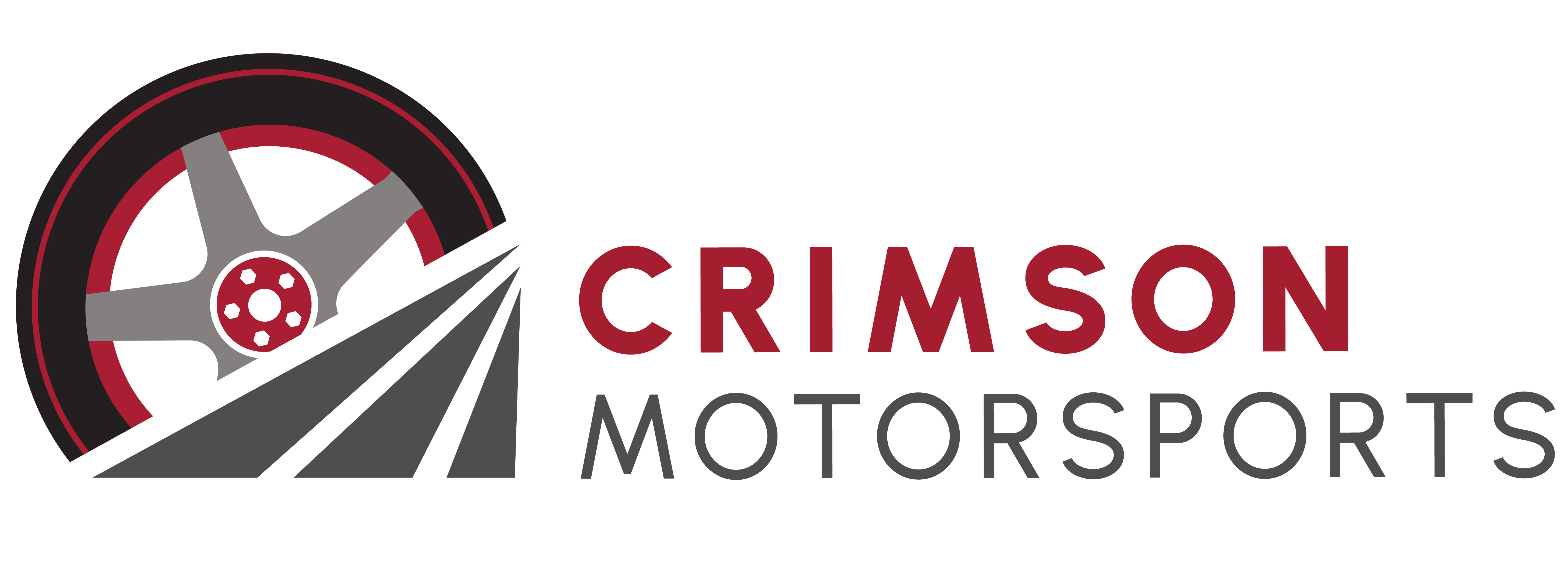
Crimson Motorsports is a Formula SAE electric race team requiring a cohesive brand identity to support sponsorship, competition, and digital presence. This project focused on developing a unified visual system that reflects performance, innovation, and technical precision across multiple applications.
Objectives
Create a strong and recognizable brand identity that communicates speed, precision, and innovation while ensuring consistency across digital, print, and physical applications such as vehicle graphics and promotional materials.
Team Structure
Collaborated with engineers and team leads to align the visual identity with the team’s performance goals and technical innovation, ensuring the brand accurately reflected both functionality and competitive spirit.
Process
The brand identity was developed through an iterative process, beginning with conceptual exploration and evolving into a cohesive visual system.
Sketch Exploration
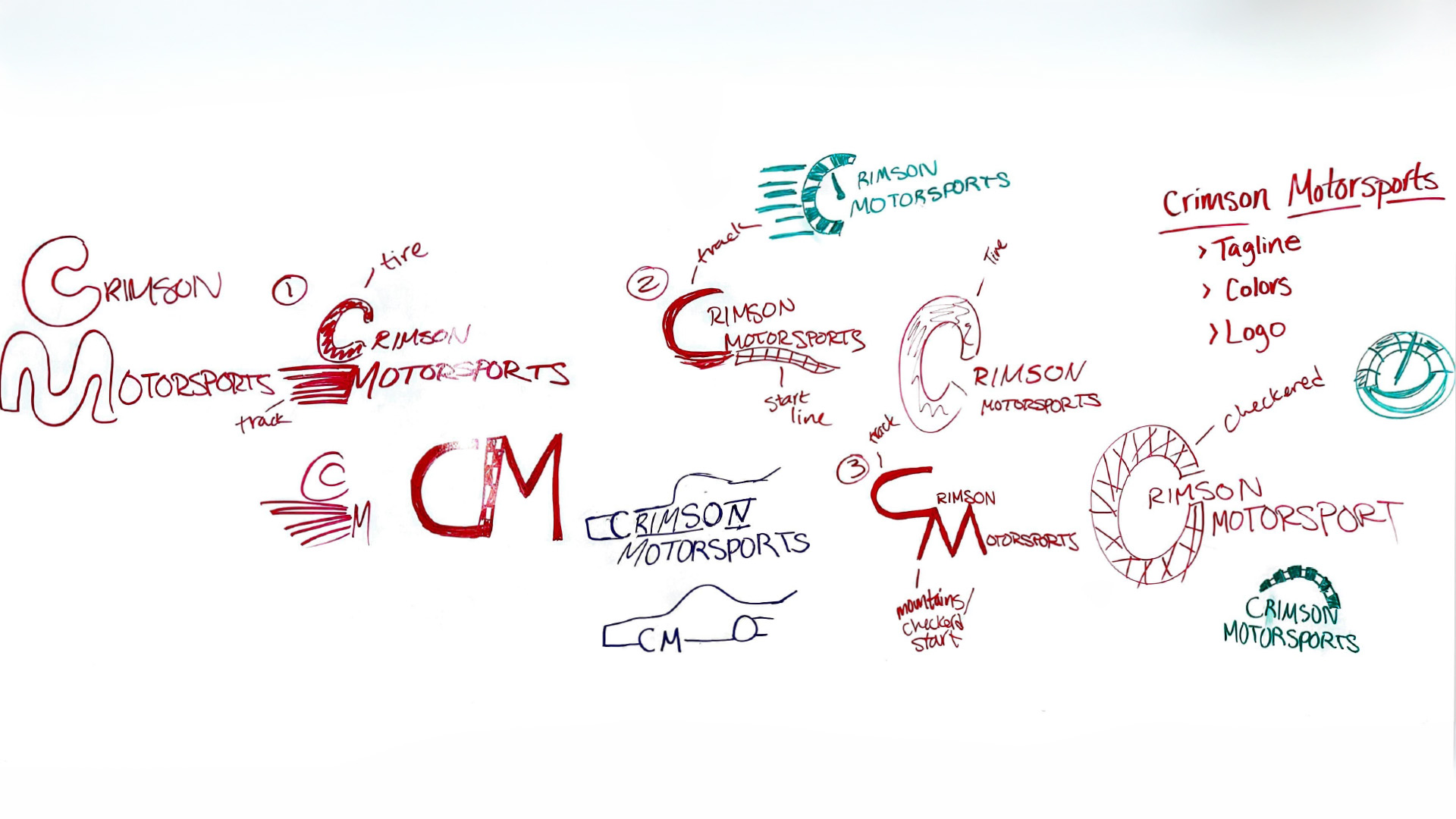
Began with hand-drawn sketches to explore initial logo concepts, shapes, and visual motifs inspired by speed, motion, and automotive design. This phase allowed for rapid ideation and experimentation before refining digital concepts.
Concept Development
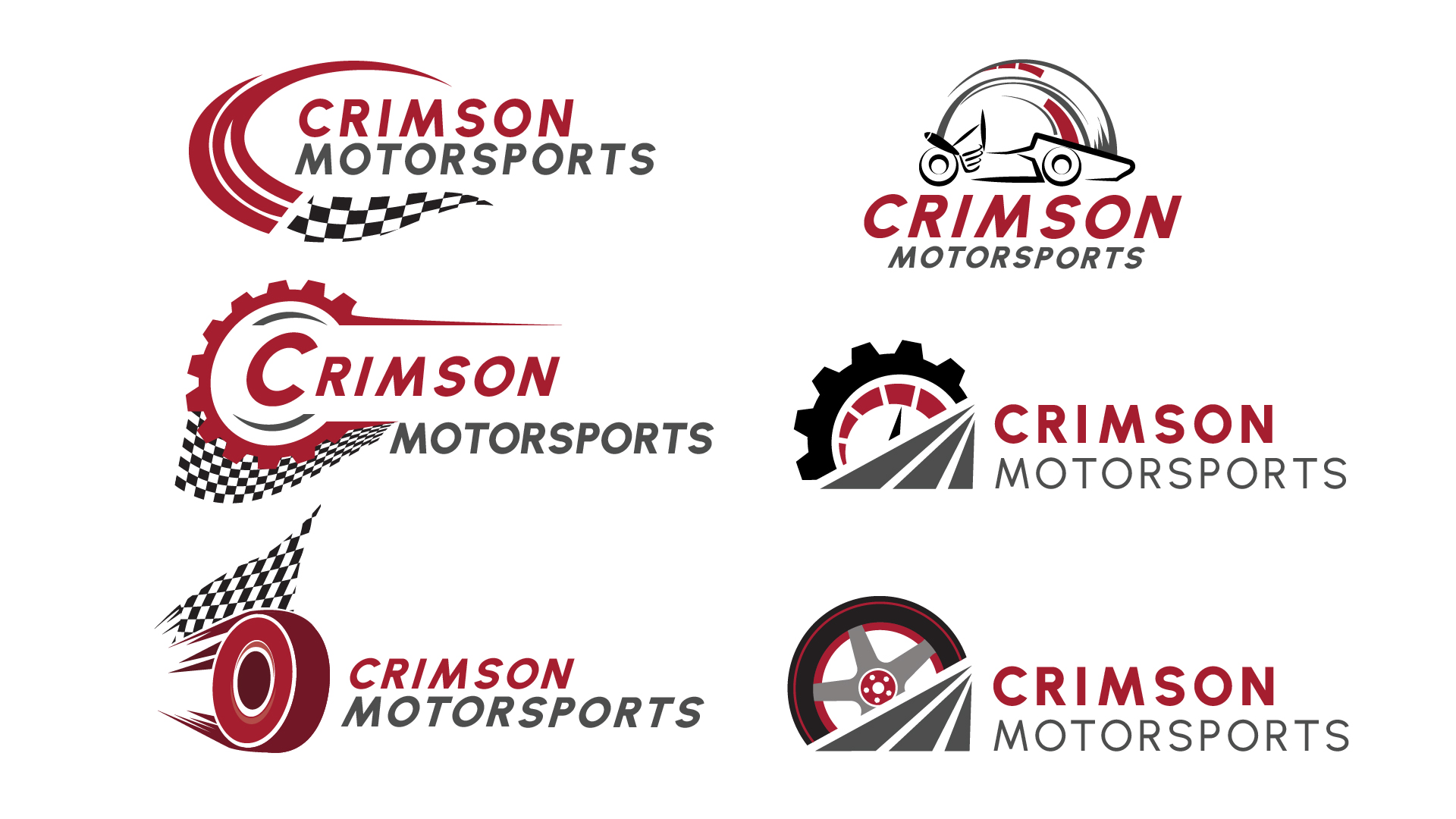
Refined selected sketch directions into more defined concepts, focusing on form, balance, and scalability across different applications.
Color Palette
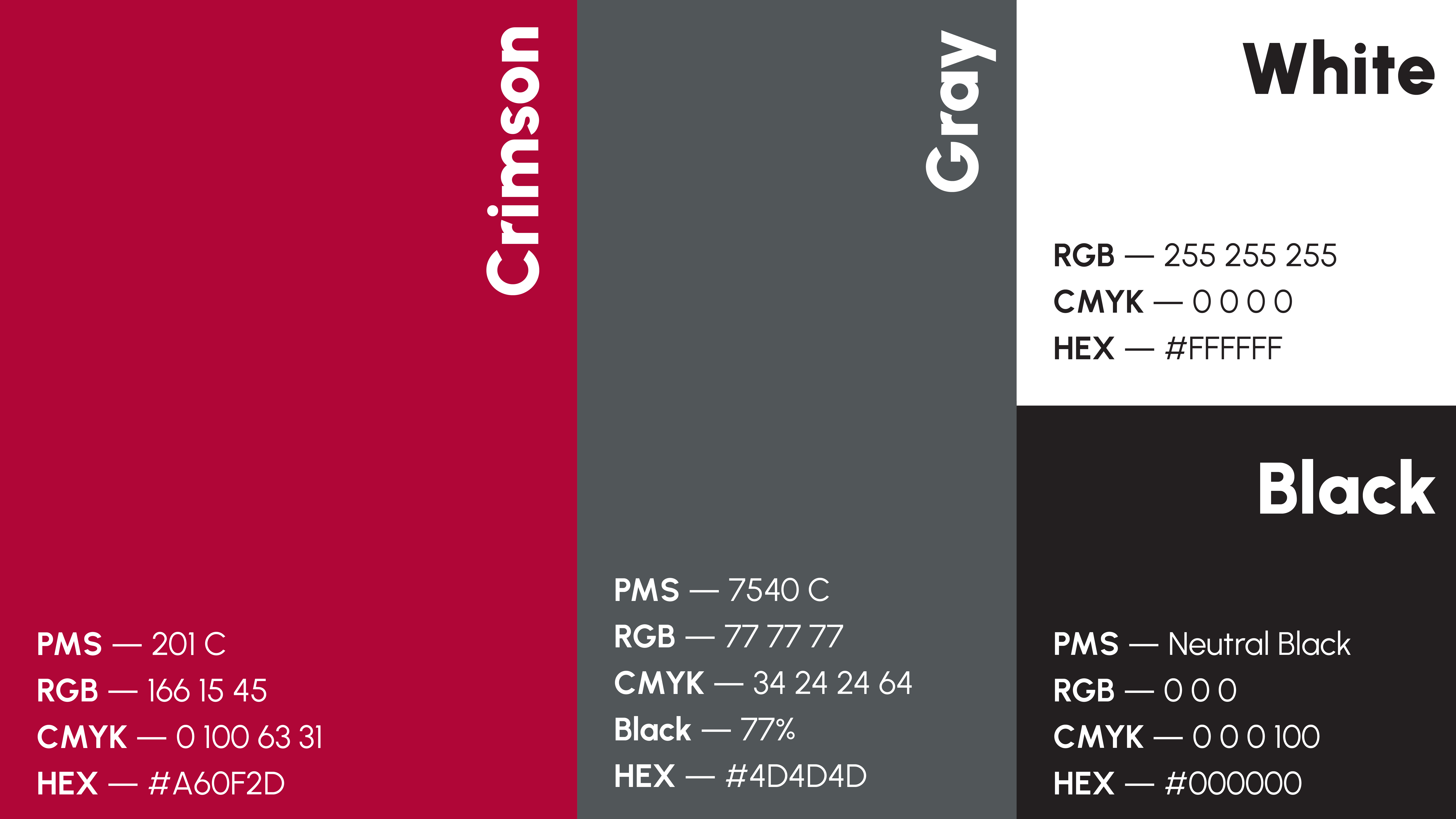
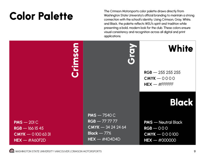
The color palette was developed using Washington State University’s signature crimson tones, reinforcing the team’s identity while creating a bold, high-contrast visual system that reflects energy, performance, and school pride.
Typography
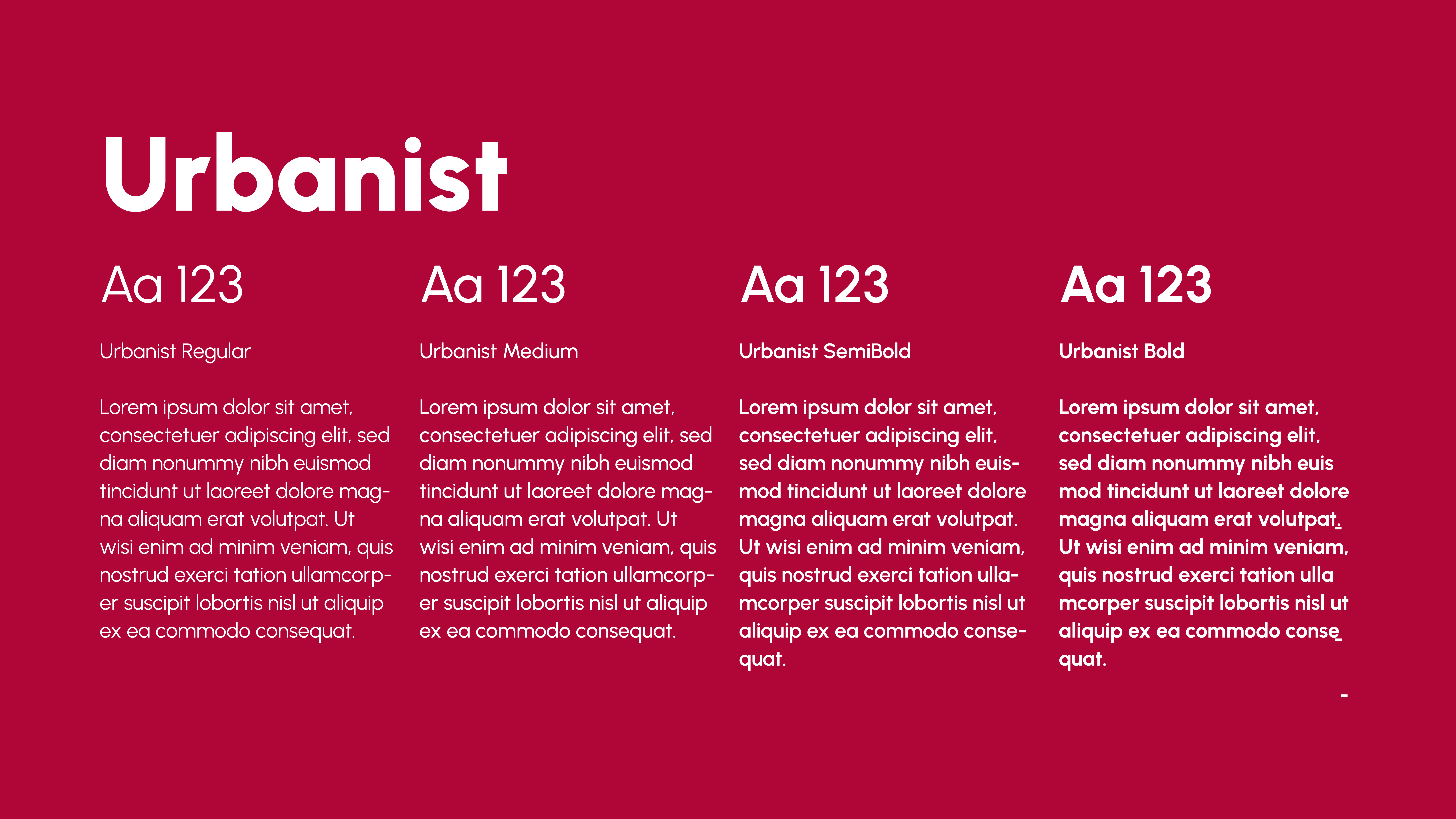
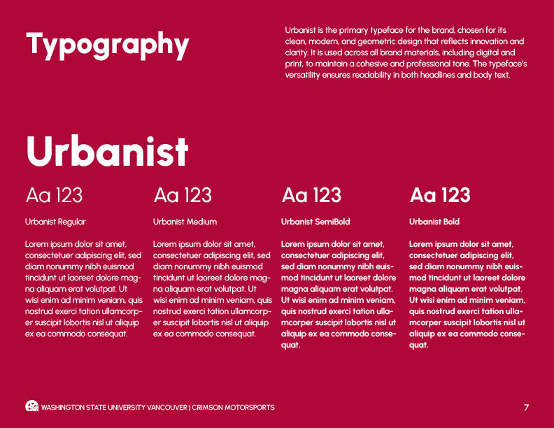
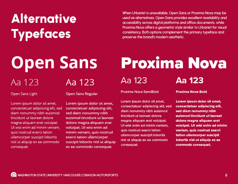
Selected typography that reinforces a modern, technical aesthetic while maintaining readability across branding and marketing materials.
Logo Design
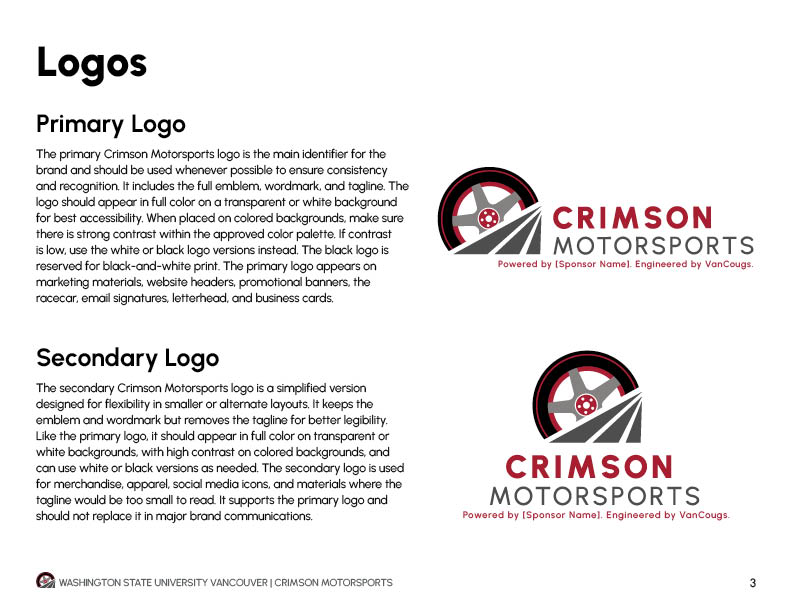
Designed a primary logo that captures motion and precision, ensuring versatility across digital platforms, printed materials, and vehicle applications.

Logo Variation
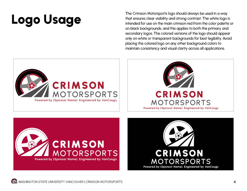
Created horizontal, stacked, and icon variations to support flexible use across sponsorship materials, digital platforms, and vehicle graphics while maintaining brand consistency.





Branding Guidelines
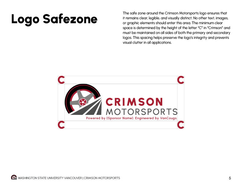
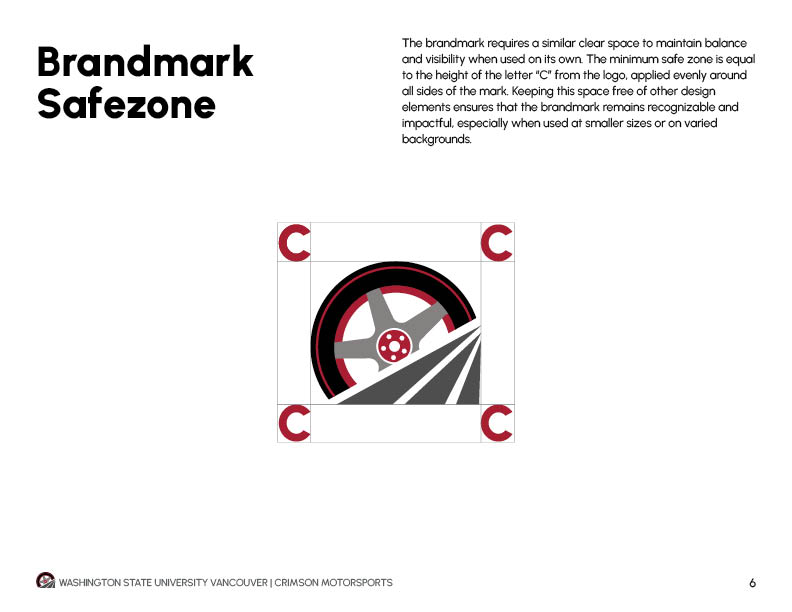
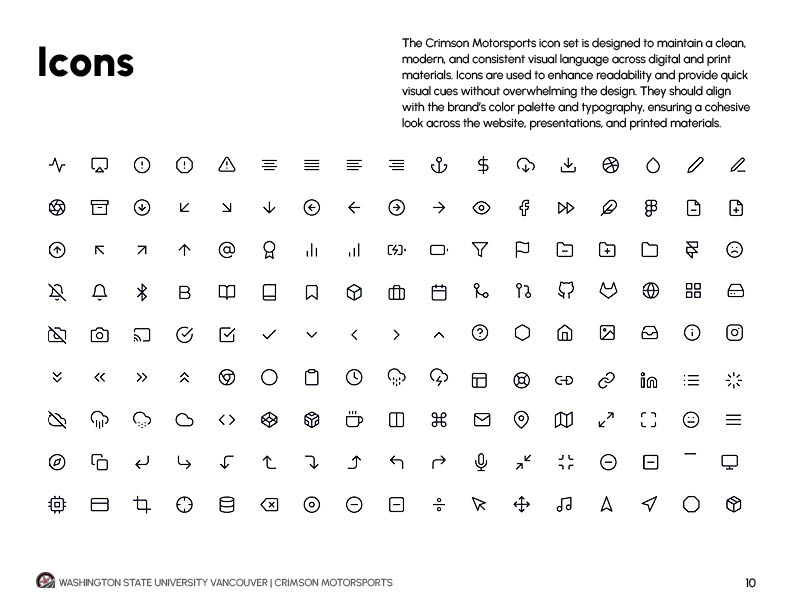
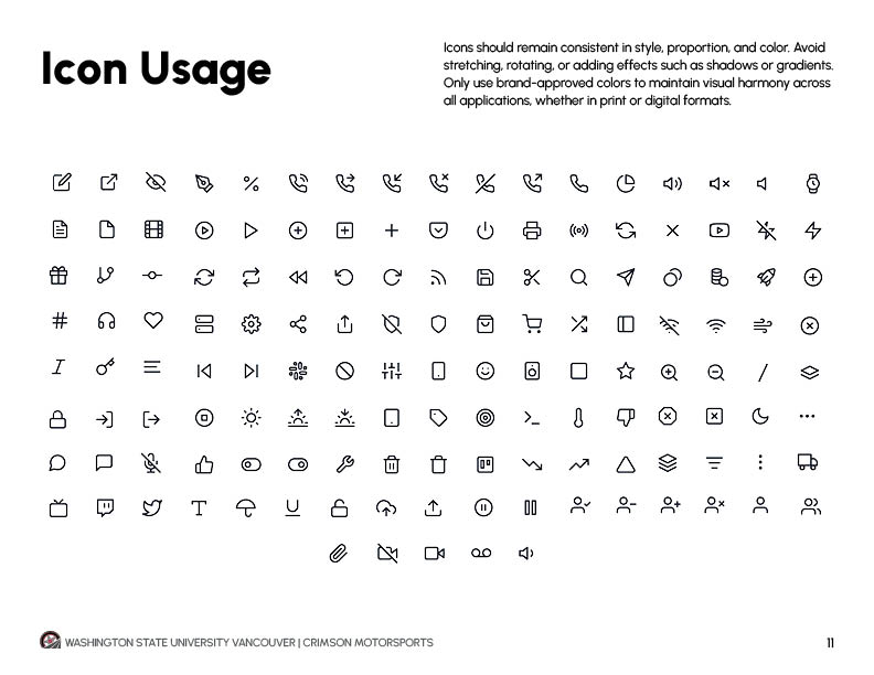
Began developing visual guidelines to document color usage, typography, logo application, and design standards, ensuring consistency across all assets and future development.

Final Outcome
Delivered a cohesive brand identity system including logo design, color palette, typography, and branding applications, ensuring consistency across digital, print, and physical assets while supporting the team’s professional and competitive presence.

Reflection
This project strengthened my ability to translate conceptual ideas into a functional brand system. I developed a deeper understanding of designing for real-world applications, particularly in maintaining consistency across both digital and physical environments.