
Overview
Fireflies is a 3D stealth puzzle-action game set within a whimsical, dark cavern environment where light functions as both a tool and a risk. As Design Team Lead, I directed the visual identity and art direction, developing a cohesive brand system that supports both gameplay and narrative.
Objectives
Develop a cohesive visual identity that enhances gameplay and reinforces the game's core mechanic of light as both a guide and a threat. Establish a consistent art direction that supports immersion and player experience within a low-light environment.
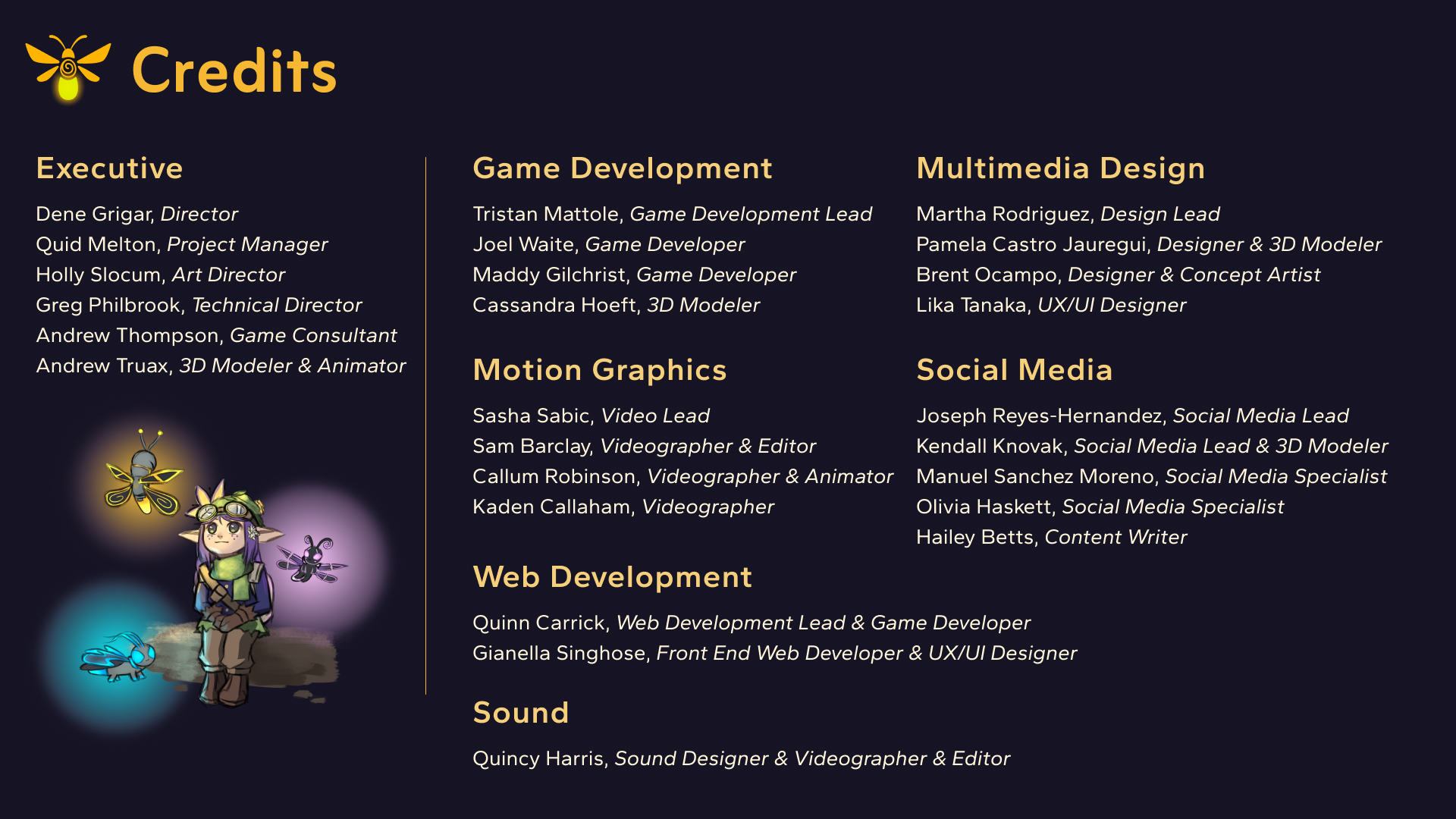
Team Structure
Led a multidisciplinary design team, coordinating workflows, providing feedback, and aligning visual decisions with developers and artists to ensure consistency across the playable prototype.
Process
The visual identity was developed through an iterative process, moving from exploration and reference gathering to finalized branding elements and guidelines.
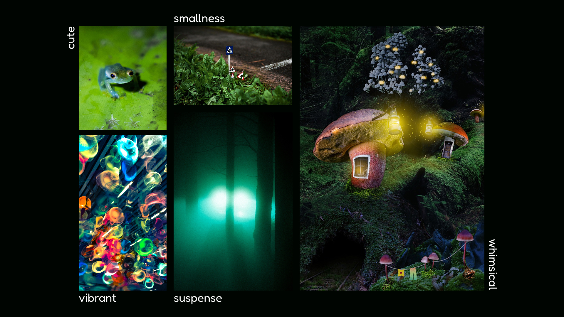
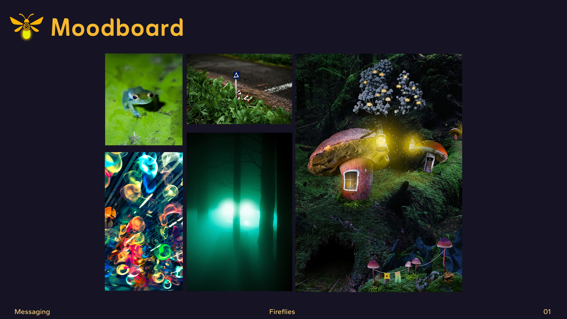
Moodboard
Created a moodboard to define the visual tone, atmosphere, and lighting direction of the game. Focused on contrast, glow effects, and environmental storytelling to support the balance between whimsy and tension.
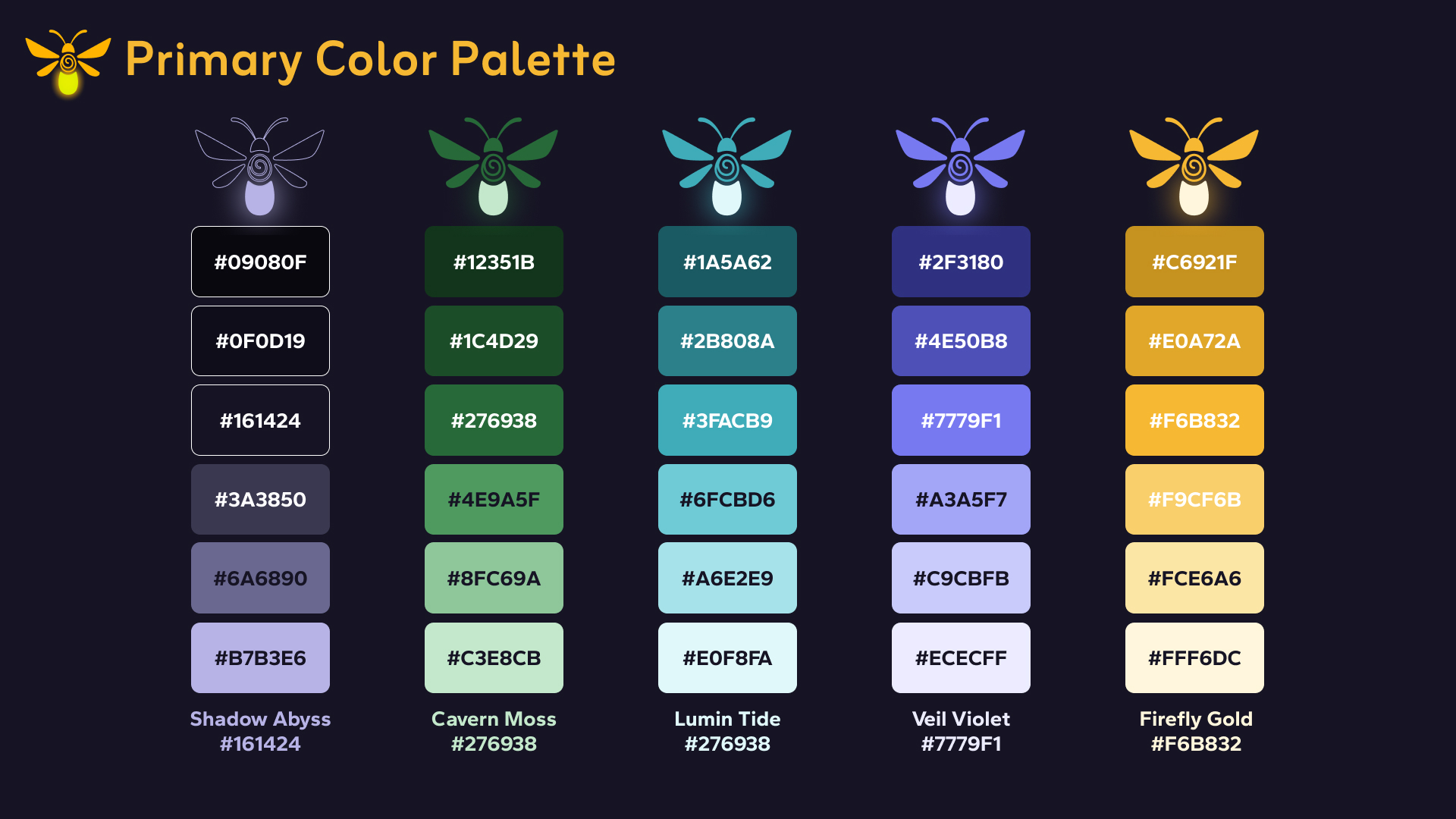
Color Palette
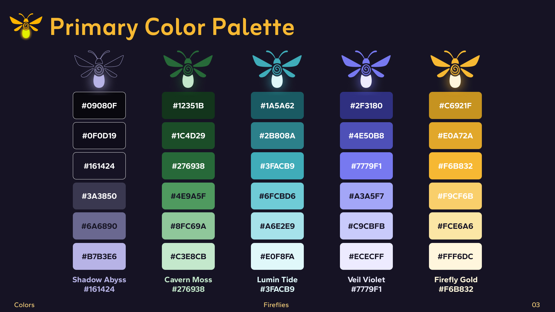
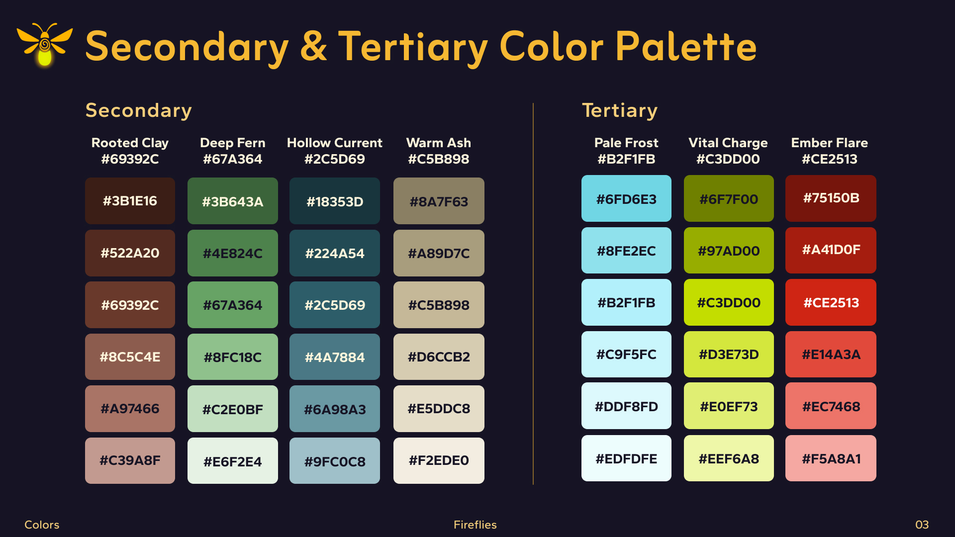
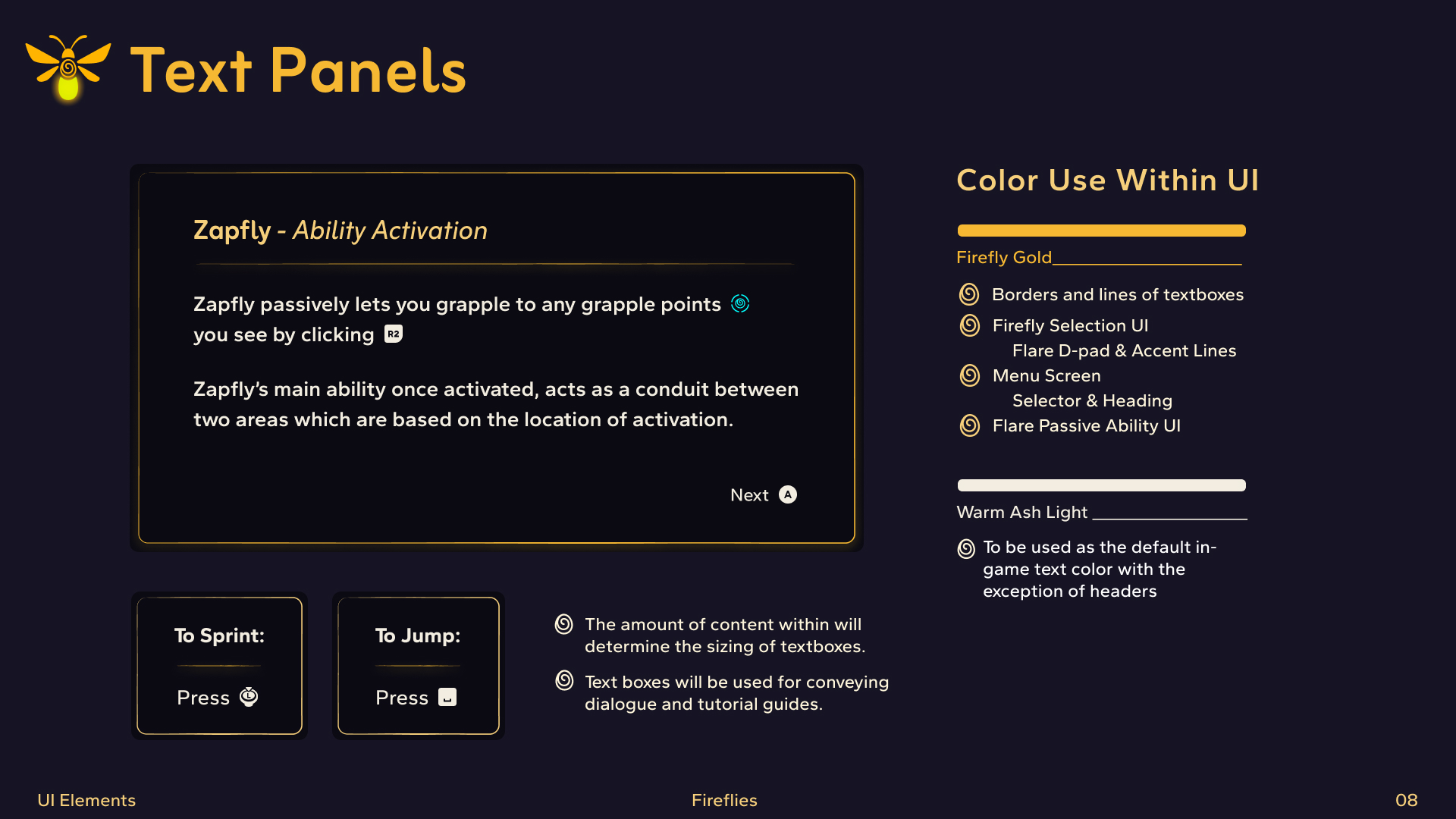
Developed a color palette centered around high contrast and luminosity to enhance visibility in dark environments while reinforcing the game's mood and gameplay mechanics.
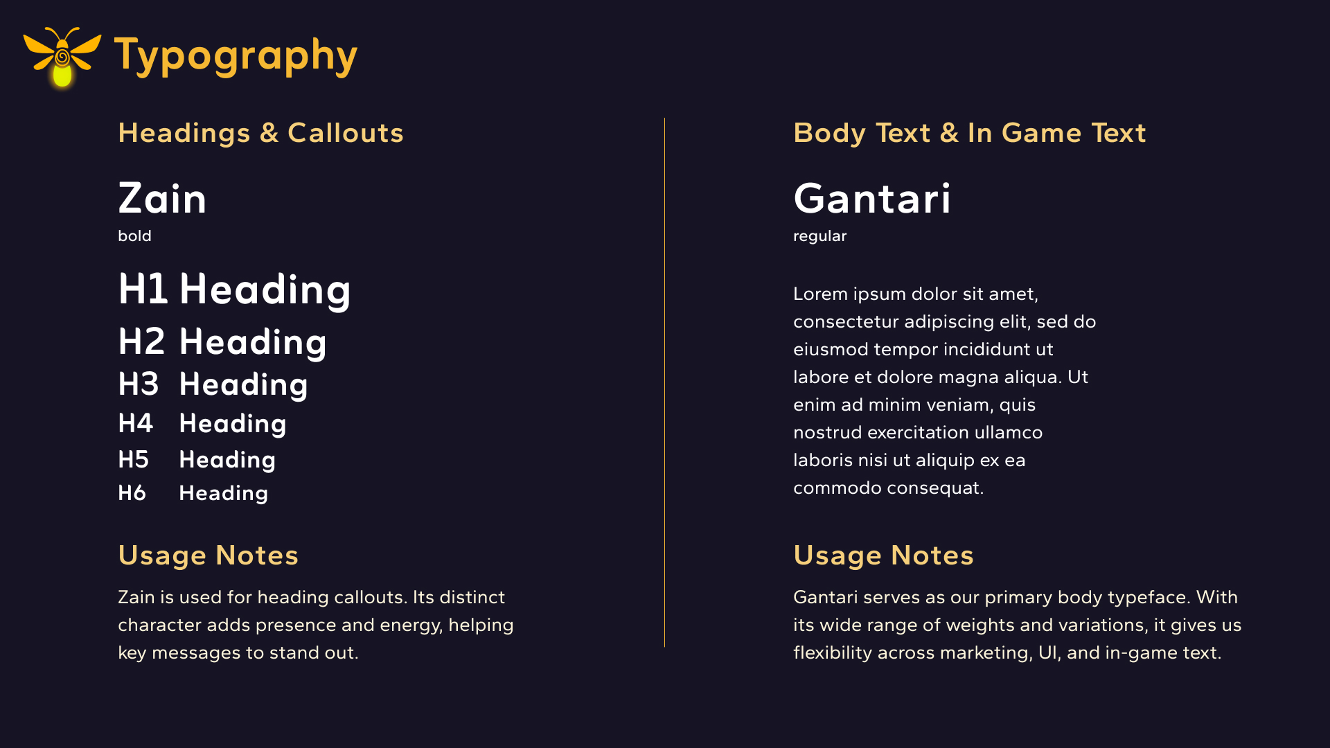
Typography
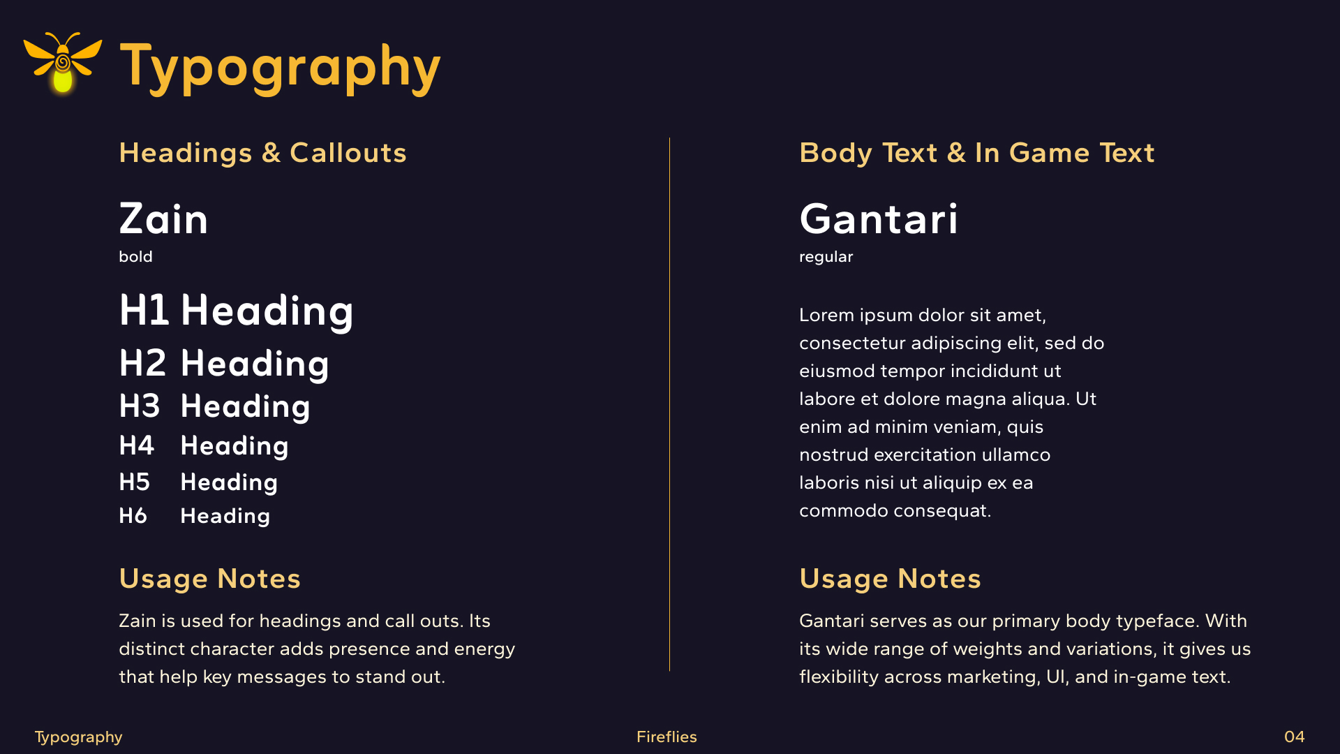
Selected typography that balances readability and personality, ensuring clarity in UI elements while maintaining alignment with the game's tone and aesthetic.
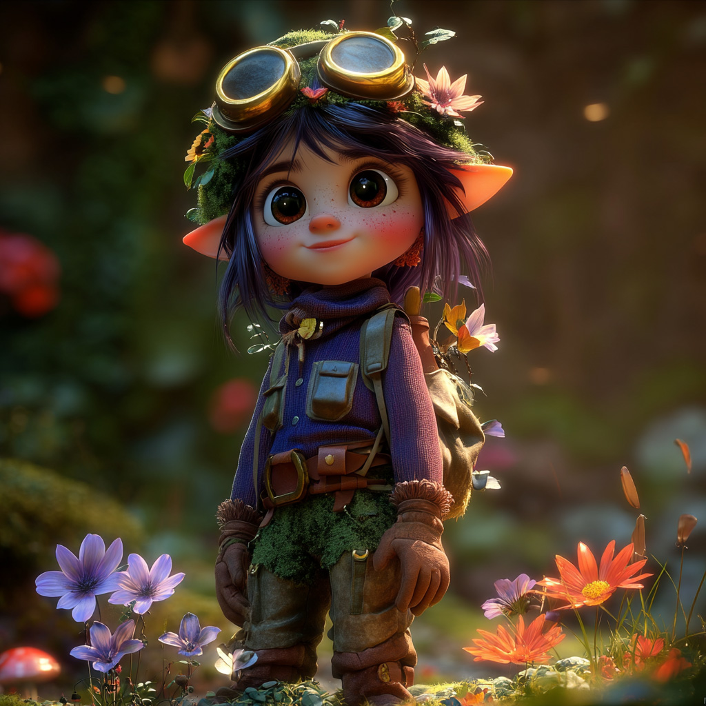
AI Concept Art
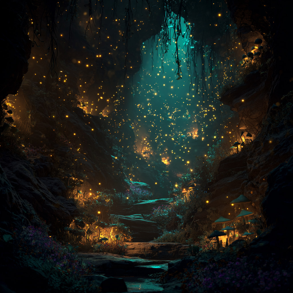
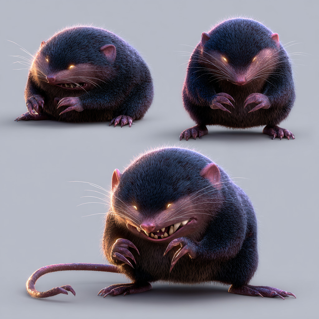
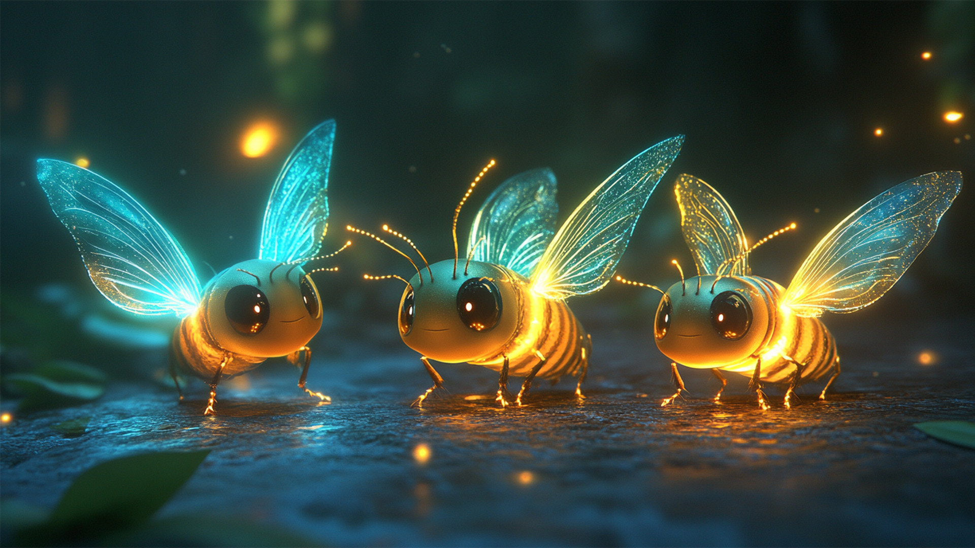
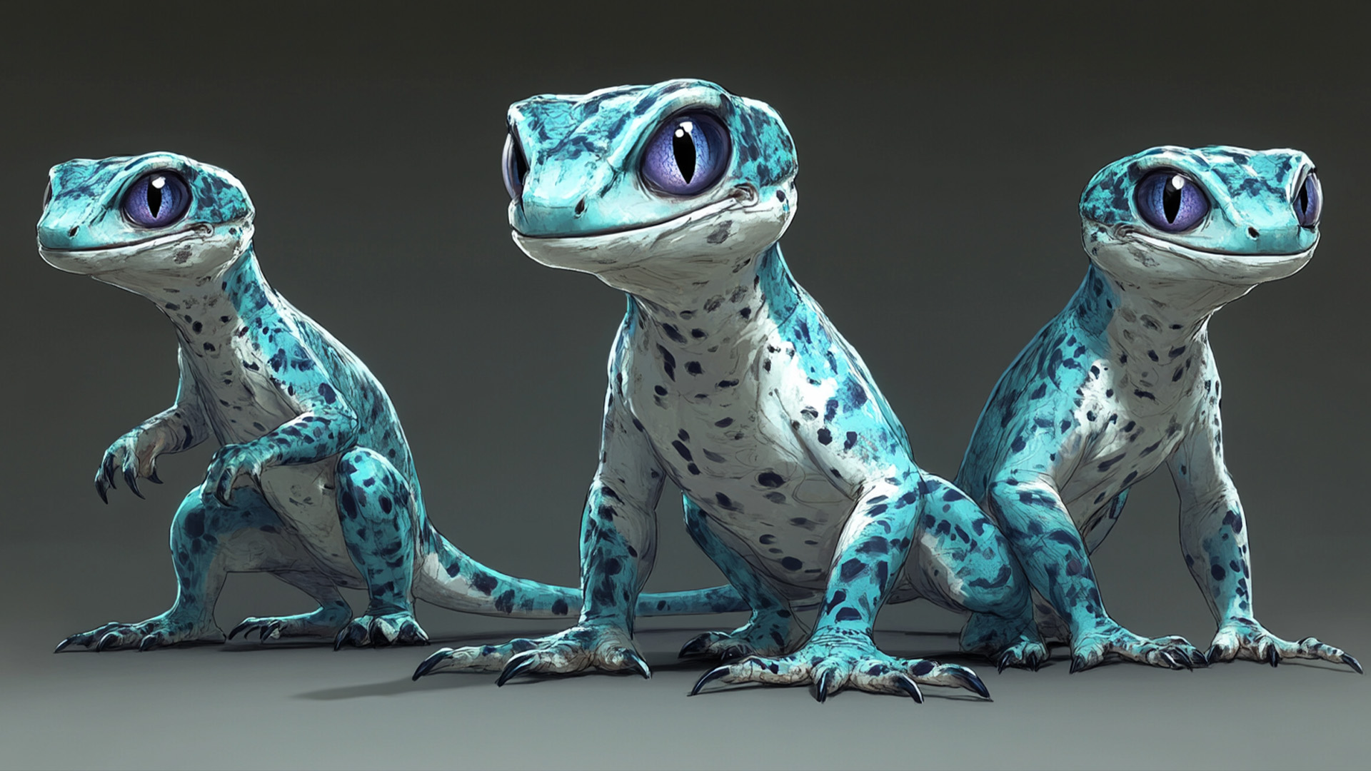
Used Midjourney to generate concept art exploring environmental lighting, character silhouettes, and atmospheric mood to guide the overall visual direction of the game.

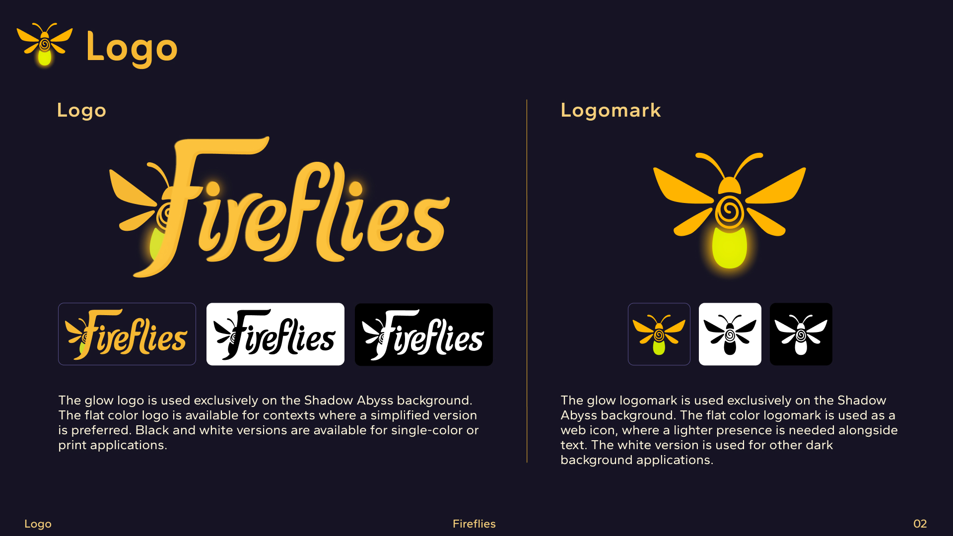
Logo Design
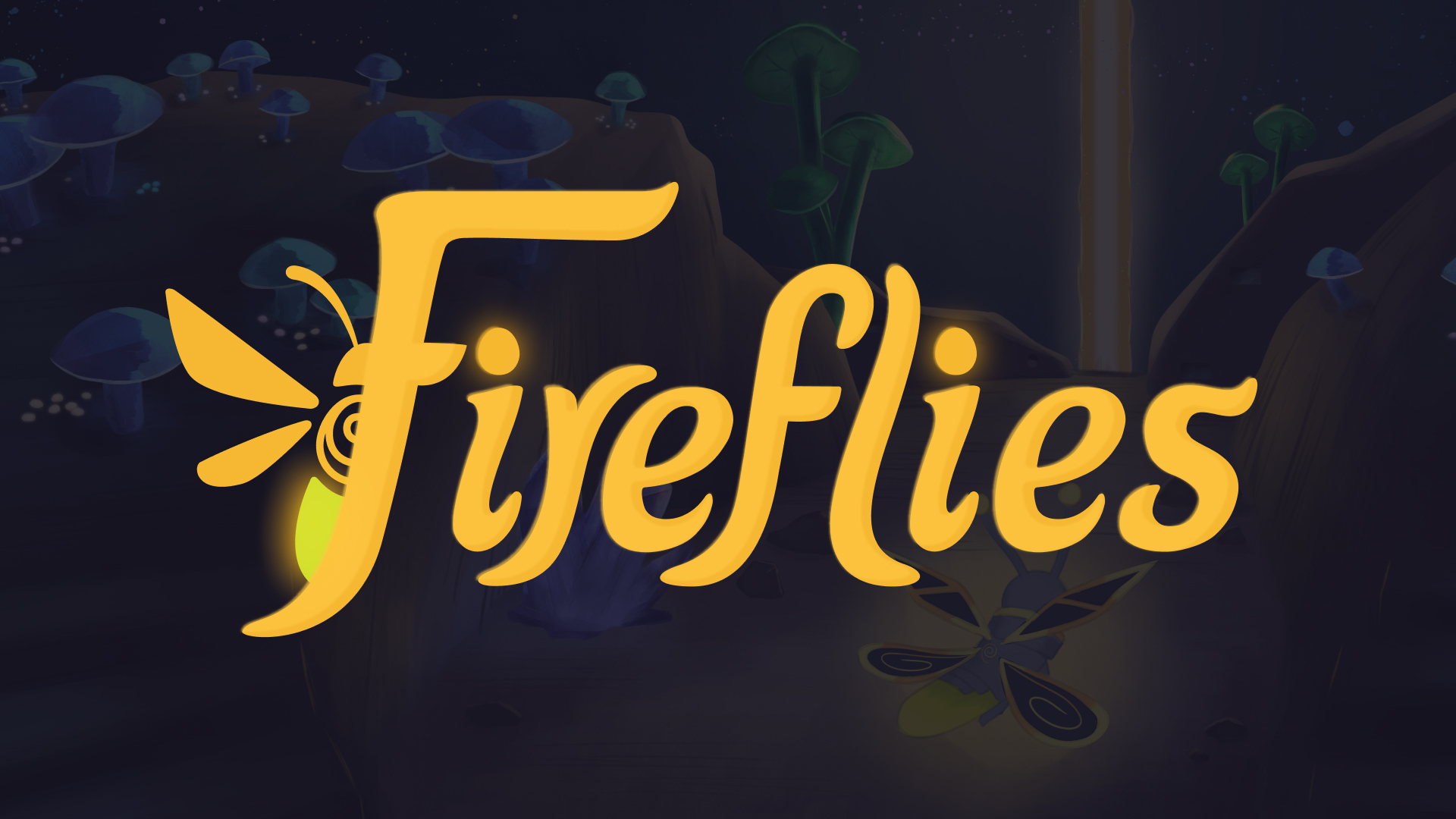
Designed a primary logo that captures motion and the duality of light in the game world, ensuring versatility across digital platforms and printed materials.
Logo Variations
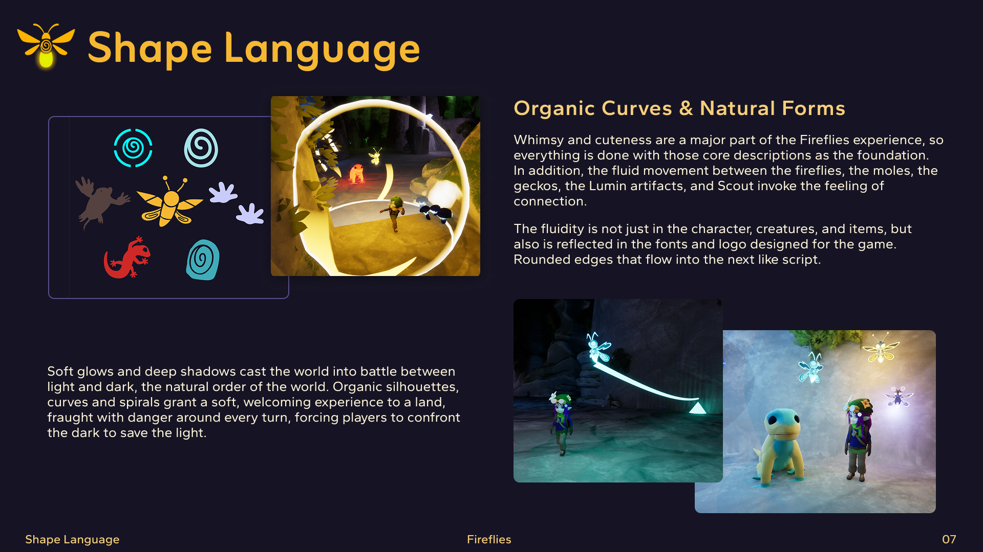
The Fireflies brand system includes a suite of logo variations designed to maintain visual consistency across a range of applications and backgrounds. A standalone logomark was developed for small-scale contexts such as app icons and social media profiles. Color variations — full-color, white knockout, and black — ensure the logo remains legible across both digital and print contexts.




Iconography
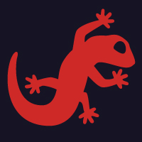
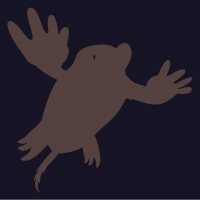
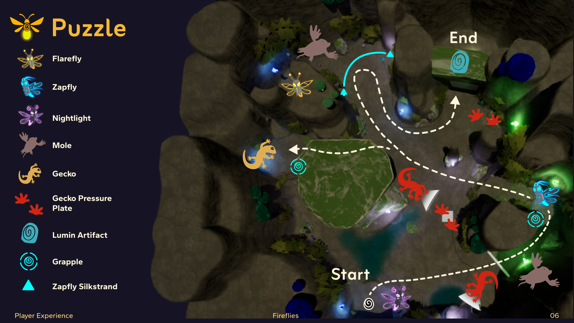
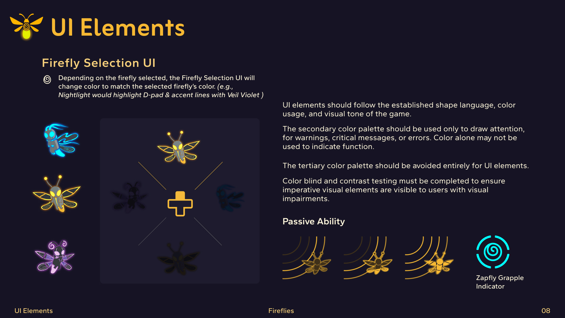
Developed a set of icons to support in-game UI and marketing materials, maintaining consistency with the overall visual language of the brand.





Branding Guidelines
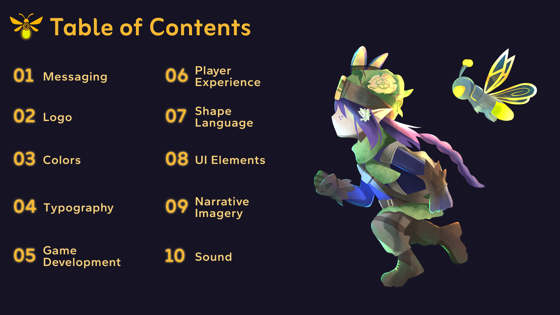
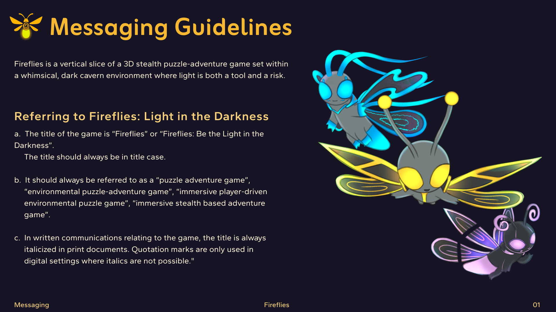
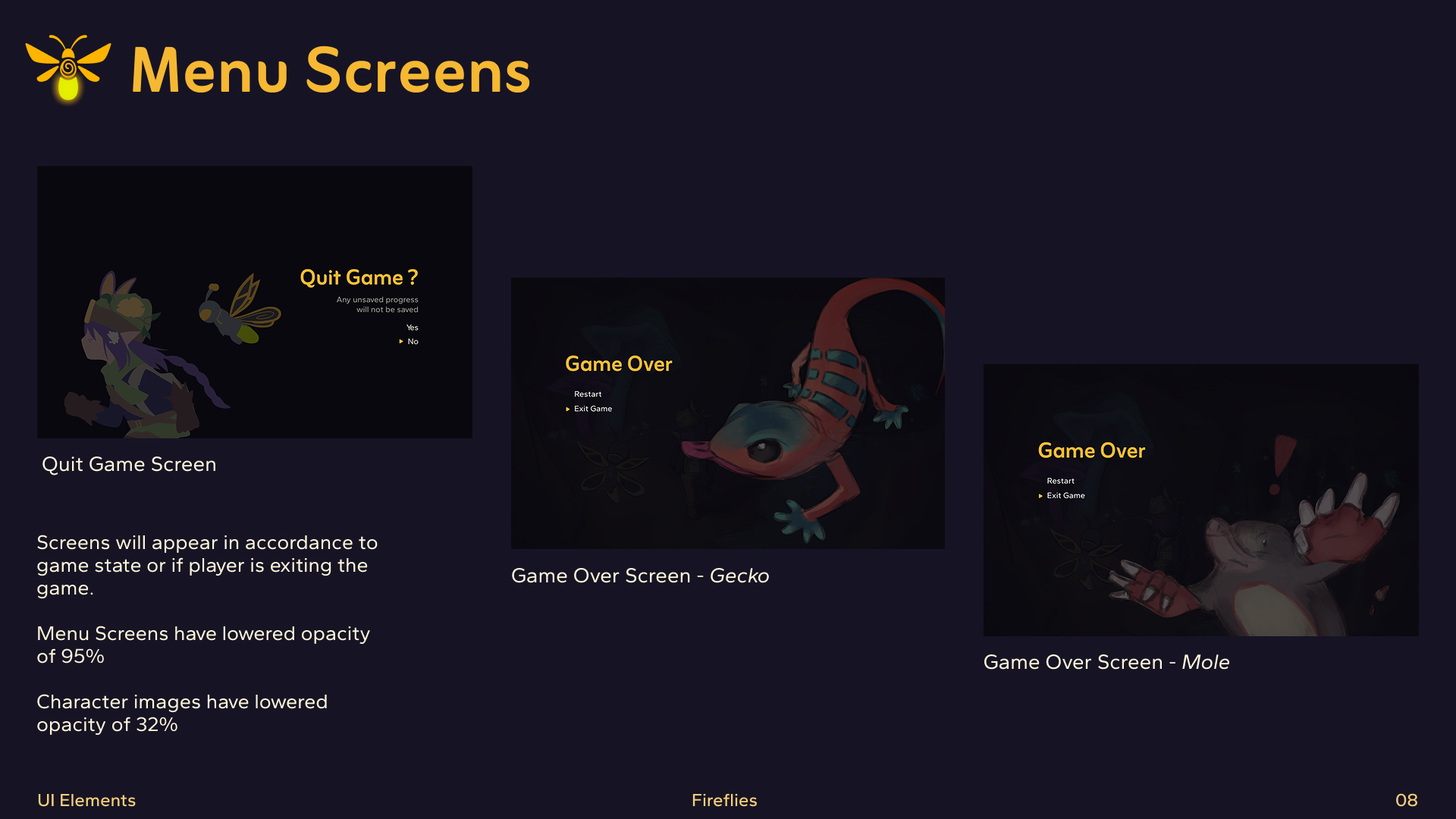
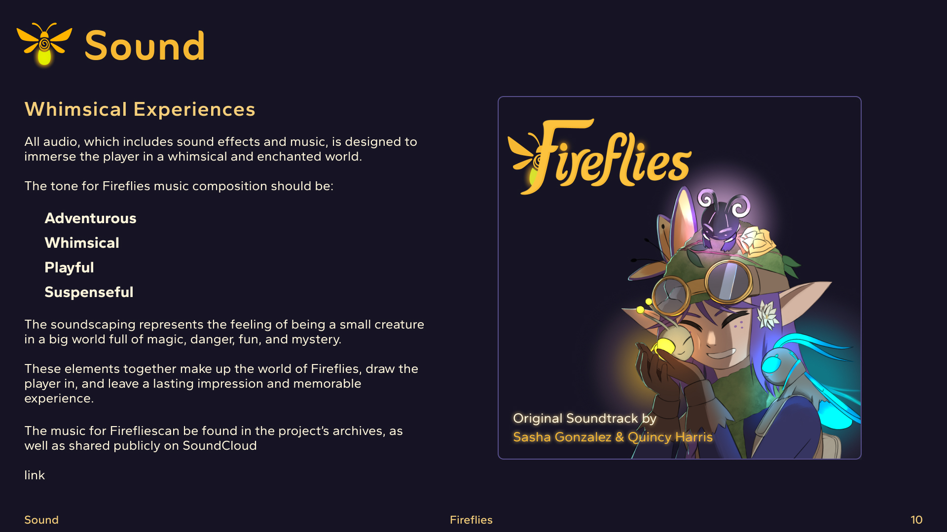
Began developing visual guidelines to document color usage, typography, logo application, and design standards, ensuring consistency across all assets and future development.
Final Outcome
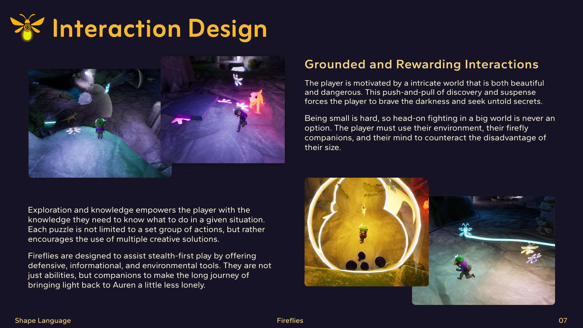
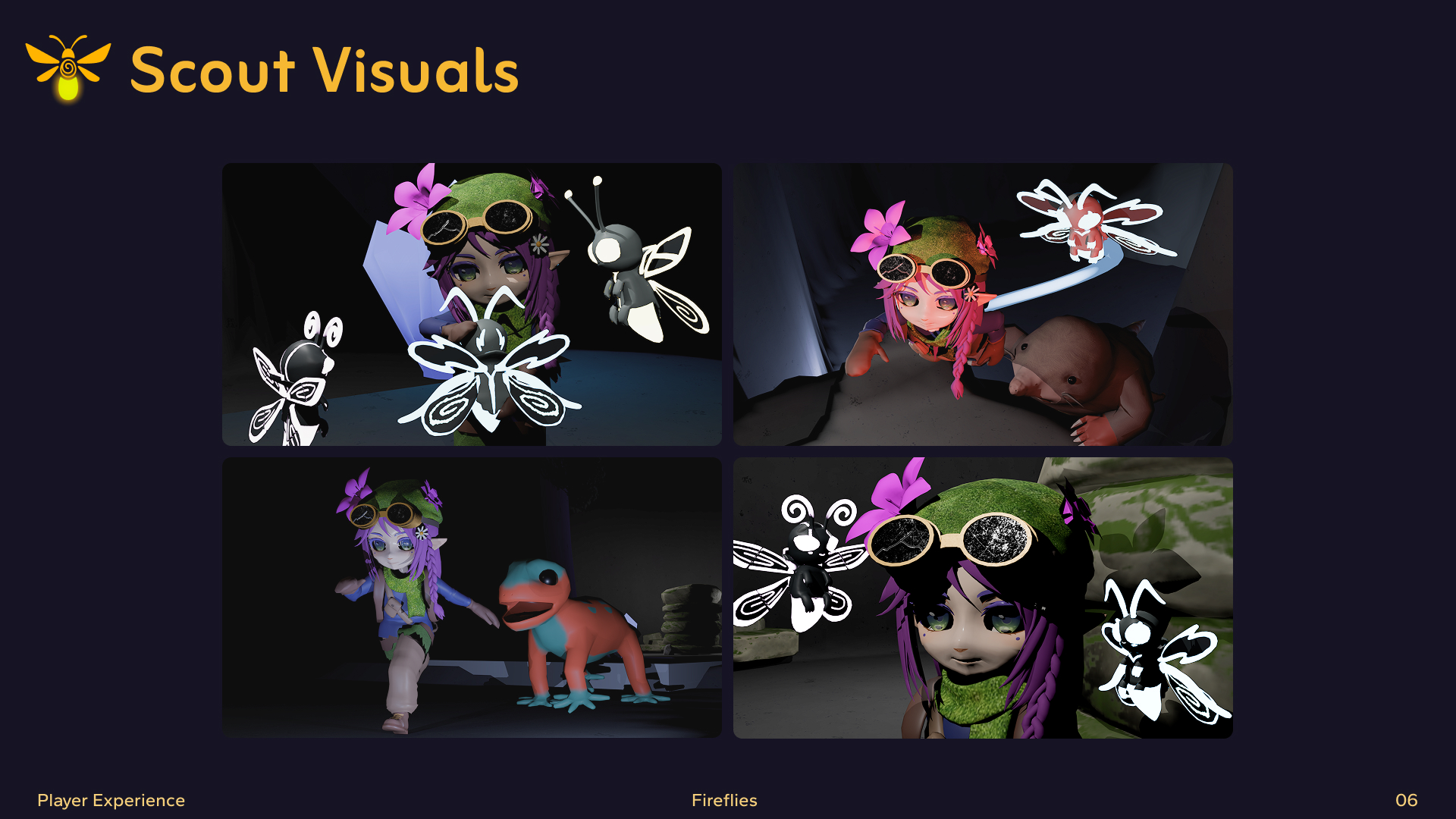
Delivered a cohesive visual identity system including logo design, color palette, typography, iconography, and in-progress branding guidelines. This unified system supports both gameplay functionality and narrative immersion, providing a strong foundation for the continued development of the game.
Reflection
Leading the design team strengthened my ability to guide creative direction while balancing collaboration and structure. I learned the importance of aligning visual decisions with gameplay mechanics and maintaining consistency across a multidisciplinary team. Moving forward, I would further refine early-stage documentation to streamline communication and accelerate design iteration.